How to create Jira reports? Plus 10 key reports and how to read them

Yes, Jira does have a reporting feature for almost everything from cumulative flow to velocity, but knowing which report answers which question is a whole separate skill. So is building a proper report for proper stakeholder questions.
In this article, we’ll walk through how to actually build a report in Jira, the difference between dashboards and reports, and then break down 10 reports you can then use in your daily work.
TL;DR
- Jira reports are built-in, project- or space-specific views designed to answer particular questions about sprint progress, velocity, workflow, releases, and backlog health.
- Native Jira reports are useful for standard Agile questions, but their customization options are limited. For richer or cross-project reporting, teams often turn to third-party apps, spreadsheets, BI tools, or the Jira REST API.
- Burndown and Velocity Charts are useful for sprint planning and progress tracking; Sprint Reports, Cumulative Flow Diagrams, and Control Charts help with retrospectives and workflow analysis; Created vs. Resolved, Time Tracking, and Pie Chart reports provide additional visibility into backlog, effort, and work distribution.
What are Jira reports?
Jira reports are predefined visual summaries of what's happening in your project, built from the data your team generates every time someone moves a card, logs time, or closes a ticket. Jira takes that data and turns it into charts, graphs, and other views that help you understand what’s happening at a glance.
The data can then be transformed into actionable charts with key project metrics for Scrum, Kanban, or whatever else works for your specific project.
Jira reports vs. Jira dashboards
A report is a predefined analysis built for a particular purpose. A dashboard is a customizable workspace where you combine different gadgets and filters to create your own view of Jira data. The two work differently in Jira.
Jira reports
Jira's native reports are tied to a specific project or space and are available from its Reports section. They include predefined reports such as:
- Burndown Chart
- Burnup Chart
- Velocity Chart
- Sprint Report
- Cumulative Flow Diagram
- Control Chart
- Version Report
- Epic Burndown
You can configure some parameters, such as the sprint, version, or metric you're looking at, but you generally work within the structure Jira provides.
Jira dashboards
Dashboards give you more control over how Jira data is presented.
You start with a saved filter, then add gadgets that visualize the data returned by that filter. For example, Jira's native gadgets include:
- Issue Statistics
- Filter Results
- Pie Chart
- Two-Dimensional Filter Statistics
- Filter Counts
This makes dashboards useful when you want recurring project metrics in one place rather than opening several individual reports.
There is one important catch: if a dashboard uses a private filter, other people may be able to open the dashboard but not see its data. When sharing dashboards, make sure the underlying filters are shared with the same audience.
Why use Jira reports?
The broad case for making detailed reports is to move your team away from gut-feeling guesses and toward data-driven Agile management. It’s also to make project management transparent, controllable, and predictable. At a more practical level, each Jira report serves a specific purpose.
Scope control
One quick suggestion at a time, and your sprint gets bigger by 10 tasks (and your team — closer to burnout). A sprint report or burndown makes that creep visible mid-sprint, while you can still push back.
Velocity tracking
Velocity is a metric that measures the amount of work a team successfully completes during a single iteration. A velocity report gives you an actual number to plan against, so your sprint commitments are based on what the team has done, not what you're hoping they'll do.
Bottlenecks prevention
A cumulative flow diagram will show you, for example, if tickets are pooling up in "Code Review" while "In Progress" stays empty. Before that report, it was a vague "reviews take a while" feeling, but afterwards, it's a visible pile-up you can point to and actually fix — by adding a reviewer or setting a WIP limit.
Meaningful stakeholder updates
A burndown chart showing exactly how much work is left and how many days remain helps you keep everyone in the loop, visualize the team’s progress, and maintain stakeholders’ trust.
Workload control
It's easy to assume Alex is swamped because they seem busy in standup. But a report showing 14 open tickets on Alex's plate versus 3 on everyone else's turns that assumption into a fact you can act on before Alex burns out or misses a deadline.
How to create reports in Jira?
While it does depend on the Jira version you’re using, creating reports in Jira is pretty simple.
Open your project and click on "Reports" in the left-hand sidebar. From the reports overview page, you can access reports for a relevant project and use them to track everything from a project's progress to workload and delivery trends. There’ll be a list of every report available for that project type.
Pick the report you need. The available reports depend on your Jira deployment, project type, board configuration, permissions, and the data your team uses, such as sprints, versions, or epics.
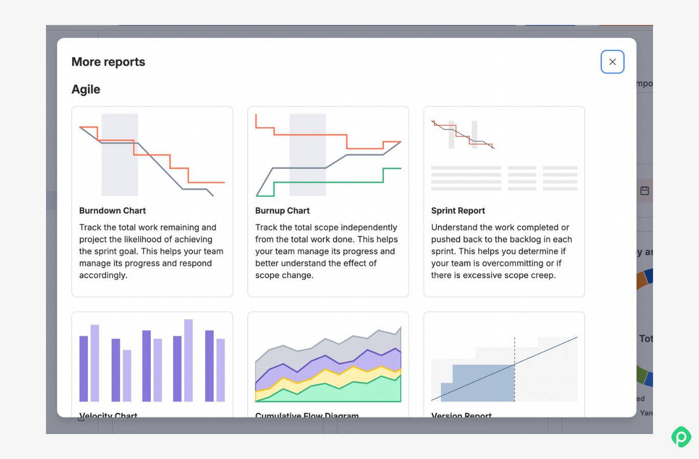
3. Configure your report settings and run the report. Most Jira reports allow you to adjust filters such as sprint or version, date range, issue type, assignee, status, team, or whatever else. Choose what you need, and Jira will render a visual report based on the selected data.
The key limitation is that native reports are predefined. You can configure the available options, but you cannot freely redesign the report or combine any Jira data points you want.
Custom reporting options
Built-in reports aren’t everything Jira offers. When a pre-built report doesn't answer your specific question, and you need Jira custom reports, you have several other ways to work with Jira data — from custom filters and dashboard gadgets to third-party apps and external reporting.
| Option | What it does | Useful for |
| JQL (Jira Query Language) queries | Allows you to run your own queries to gain insights from your issues and data. | Creating reusable datasets for dashboards and reporting. |
| Dashboard gadgets | Turn saved filters into visual summaries using Jira gadgets such as Filter Results or Two-Dimensional Filter Statistics. | Useful for keeping recurring project metrics in one place. |
| Marketplace apps like Planyway for Jira | Add specialized reporting capabilities on top of Jira data. | Advanced, cross-project, or highly customized reporting.
|
| Export to spreadsheets | Export issue data to Excel CSV and generate Jira custom reports in Google Sheets or Excel. | Custom calculations, ad hoc analysis, and sharing. |
| REST API | Pull Jira data into external tools and build custom reports programmatically. | BI dashboards, automated reporting, or internal tools. |
What types of Jira reports are there? Or the 10 reports you really need
The most common Jira reports can be broadly grouped into four categories:
- Agile reports — To understand team velocity, spot bottlenecks, and predict future performance
- Release and delivery reports — To track releases, monitor delivery progress, and understand cycle times.
- Issue analysis reports and workload reports — To understand what the team is working on, how work is distributed, and how the backlog is changing.
- Forecast and management reports — To use historical data to improve estimates, plan future work, and make more informed delivery decisions.
Here are 10 of the most useful reports to know, covering different planning horizons and stakeholder needs.
The core 5 Jira reports for daily execution and sprint planning
Let’s start with the five reports you may actually open on a regular Tuesday to keep a sprint honest, help plan the next one, and answer stakeholder questions properly.
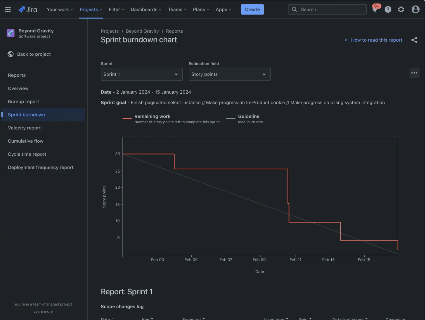
1. Sprint Burndown Chart
Source: atlassian.com
Best for: daily standups and keeping tabs on sprint progress
This report shows how much work remains in a sprint compared with how much should remain if the team is on track. If the remaining work isn’t burning down as expected, it’s a signal to check for blockers, scope changes, or tasks taking longer than planned.
2. Velocity Chart
Best for: Sprint planning and capacity forecasting
The Velocity Chart shows how much work a team has completed across previous sprints. Teams typically use recent sprint averages to estimate how much work they can realistically commit to in future sprints.
Velocity charts cannot guarantee team performance, but they provide useful historical data for planning. If a team usually delivers 30 points/sprint, planning for 45 is dangerous optimism. A Velocity chart will help you with a reality check on that.
3. Sprint Report
Best for: Sprint reviews and retrospectives
The Sprint Report provides an overview of all things complete, incomplete, removed, or put on hold during a sprint. It helps teams understand what was delivered, what changed during the sprint, and whether the original scope was realistic.
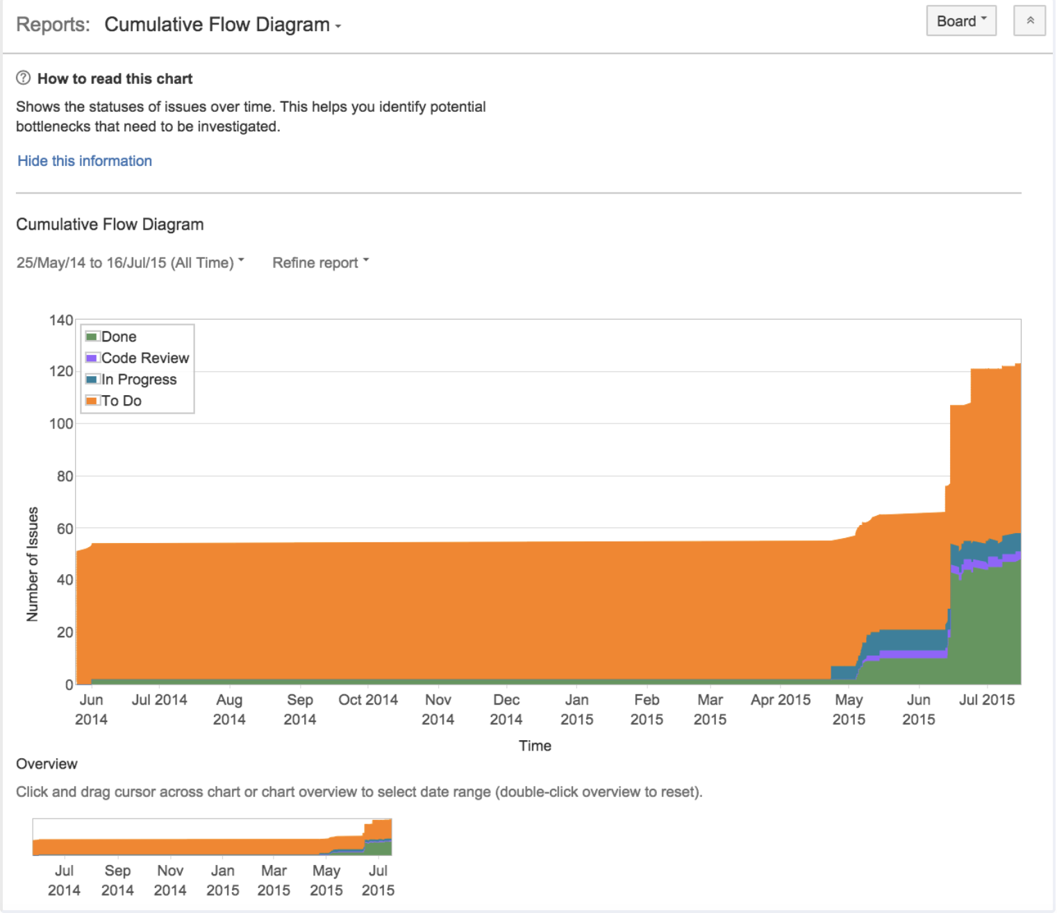
4. Cumulative Flow Diagram (CFD)
Best for: Retrospectives and workflow optimization
The CFD tracks how work moves through your statuses over time. Teams can use it to identify bottlenecks, growing backlogs, or workflow issues.
If, for example, you see your “In Progress” section widening, it may be a sign that too much work is being started before existing tasks are completed. The CFD catches that pattern before you have a pile of half-done tickets nobody wants to own on your hands.
5. Control Chart
Best for: Delivery forecasting and cycle time analysis
The Control Chart visualizes the cycle time of a project or a sprint, showing how long issues actually take from start to finish. Instead of estimating from scratch every time, you can lean on real historical data to realize how long similar work may take in the future and identify changes in delivery performance.
Jira reports for releases and high-level planning
These reports help teams track larger initiatives and communicate progress beyond individual sprints. They are useful when it comes to strategic decisions rather than day-to-day syncs.
6. Version Report
Best for: Release planning
The Version Report helps teams track progress toward completing a release. It shows what has been completed and what remains. Based on this data, teams can evaluate whether they meet the target date or whether scope adjustments are in order.
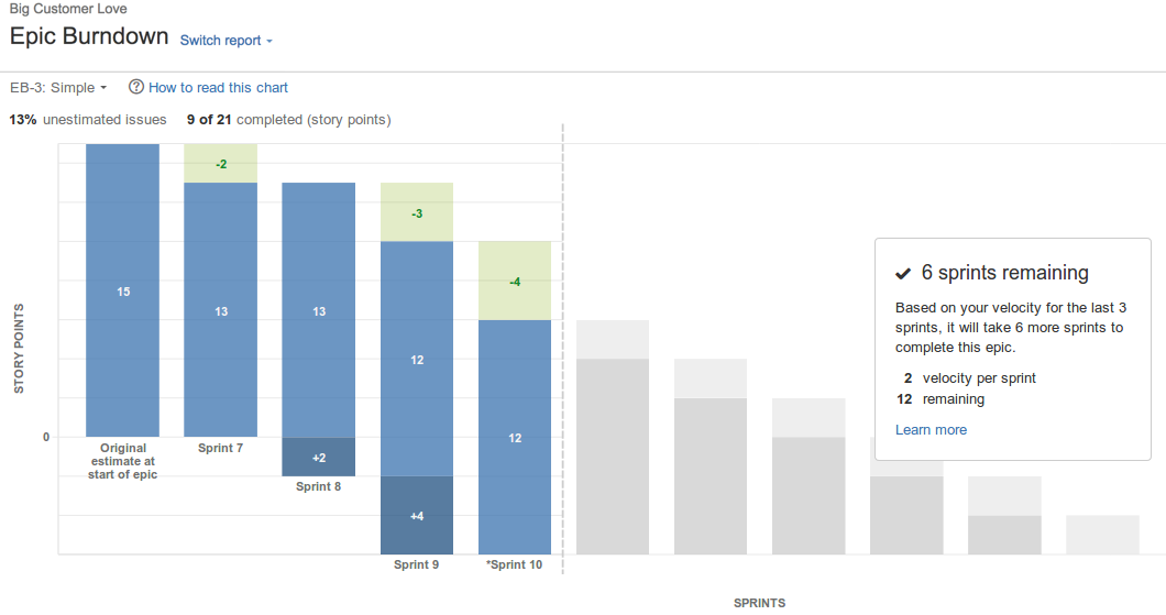
7. Epic Burndown Report
Source: atlassian.com
Best for: Epic and roadmap tracking
The Epic Burndown Report helps teams monitor progress toward completing a larger body of work (the one that is actually called “epic”). The report shows whether an epic is moving toward completion and highlights the impact of scope changes.
Jira reports for backlog health, estimates, and team insights
These reports provide additional visibility into workload trends and improvement opportunities.
8. Created vs Resolved Issues Report
Best for: Backlog health monitoring
The Created vs Resolved Issues Report compares the number of new issues created with the number of issues resolved over time. If new issues consistently outpace resolved ones, use this report to identify growing backlog pressure and revisit prioritization.
9. Time Tracking Report
Best for: Understanding effort and improving estimates
Time Tracking Report visualizes the original and current time estimates for issues in the current project. This can help you determine whether work is on track and identify where estimates may need adjustment.
For more advanced needs such as comparing time spent across multiple projects or teams, Jira’s built-in reporting may not provide enough flexibility, and teams often use dedicated reporting apps.
10. Pie Chart Report
Best for: Understanding work distribution and exec reporting
The Pie Chart Report helps visualize how issues are distributed by different fields, such as issue type, priority, status, or assignee. It’s one of those reports that Jira does very well out of the box. It is helpful when project managers need to identify patterns or report to the executives on what you’re doing and what their resources are going into.
Jira reports cheat sheet
| Need | Report |
| Track daily sprint progress | Burndown Chart |
| Plan future sprint scope | Velocity Chart |
| Review sprint outcomes | Sprint Report |
| Identify workflow bottlenecks | Cumulative Flow Diagram |
| Estimate delivery timelines | Control Chart |
| Monitor release progress | Version Report |
| Track large initiatives | Epic Burndown Report |
| Analyze backlog growth | Created vs Resolved Issues |
| Compare estimates and actual effort | Time Tracking Report |
| Identify trends in workload distribution | Workload Pie Chart Report |
Why Jira built-in reports aren’t enough
Jira's built-in reports and dashboard gadgets are useful for getting standard project metrics at a glance. But the more specific the reporting question becomes, the more you may have to work within Jira's predefined options.
Limited customization
Jira gives you a set of built-in gadgets and visualizations, but you don't have complete control over how your data is presented. For example, a native Pie Chart can show how issues are distributed, but you're limited in what additional information you can add to that visualization.
Limited ways to combine metrics
Sometimes the data you need is already in Jira — you just can't easily put it together in one view. You may want to show percentages, story points, issue counts, or other metrics alongside the same breakdown. Native gadgets don't always give you enough flexibility to combine those data points.
Static dashboards
Native gadgets can also be quite static. They answer the question you've configured them to answer, but stakeholders rarely stop at one question. If someone asks, “What does this look like for a different priority?” or “Can we see this by another metric?”, you may need to change the configuration or create another gadget.
Too many compromises
The result is that you can have all the underlying Jira data you need and still struggle to turn it into the exact view you want. You're essentially choosing from the visualizations and metrics Jira gives you rather than freely deciding how to tell the story of your project's health.
How to extend Jira’s native reporting capabilities
If the limitations we’ve mentioned above get in your way, you have two options: extending Jira with a dedicated app or moving your reporting data into an external reporting tool. Let’s go over the first option using Planyway for Jira as an example.
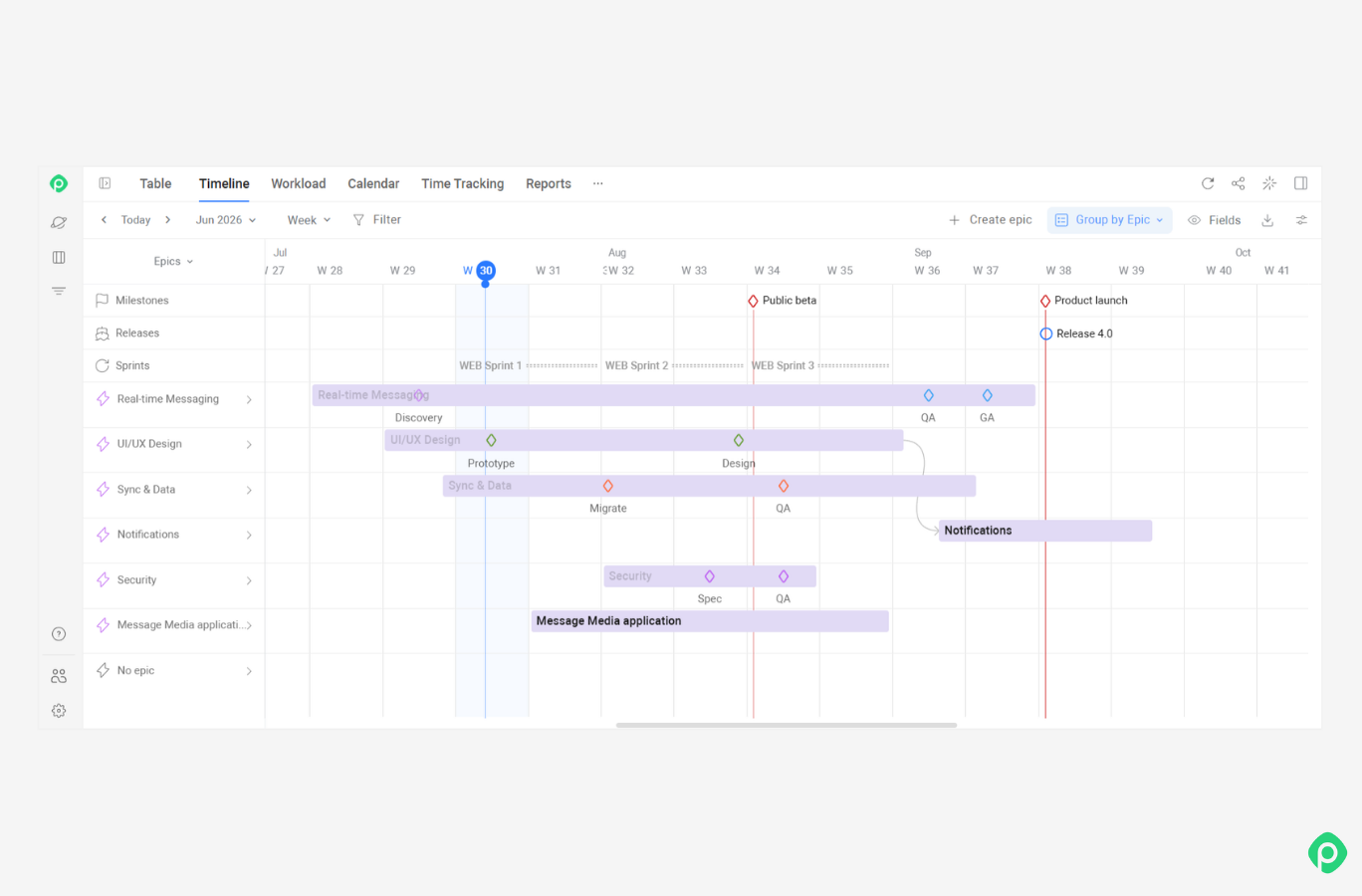
Unlike a basic chart tool, Planyway for Jira is actually an all-in-one project planning app that combines visual planning, resource management, time tracking, and reporting in one workspace. It works with your existing Jira data, so you can use the same issues and work items to build timelines, track workload, compare planned and actual effort, and report on time spent.
Use Planyway views as reporting views
Not every Planyway view is a report in the traditional sense, but each can give you a different way to present Jira data depending on the question you're trying to answer.
- Timeline / Roadmap — see work across multiple Jira projects in one timeline, including dates, dependencies, milestones, and releases — and use it to report on project progress and upcoming work.
- Workload — compare scheduled work with available capacity to see who's overloaded, underutilized, or available for more work.
- Table — get a structured view of your Jira work items and their hierarchy, with the details you need for a more granular project overview.
- Calendar — see scheduled work by date, get a calendar-based view of what's coming up, and give stakeholders a date-based view of scheduled work and upcoming deadlines.
Then there are dedicated reports for questions that require more detailed analysis:
- Time Tracking — see how much time was logged and where it went across projects, Jira users, epics, or work items.
- Timesheets — drill down into individual time entries and review logged hours by person or period.
- Planned vs. Tracked — compare planned or estimated effort with actual logged time to see where delivery differs from the original plan.
- Workload Report — analyze planned work against available capacity and identify resource allocation issues.
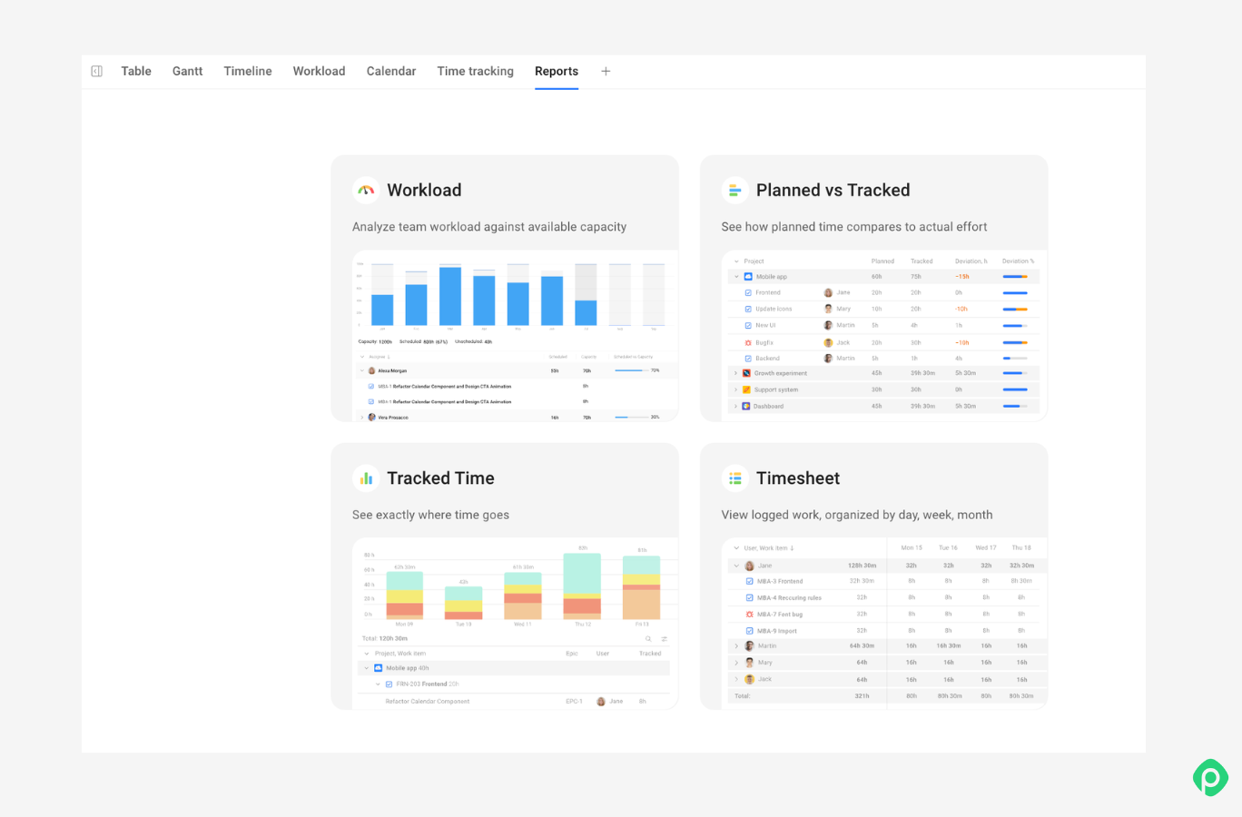
This gives you something Jira's native reports don't provide on their own: a way to connect project reporting with the planning and resource data behind it. Instead of looking at velocity, issue status, or backlog growth in isolation, you can also see what is planned, who can take it on, how much work is already scheduled, and how actual effort compares with the plan.
Your reports can bring much more
It’s important to remember that the reports don't (and can’t) replace your judgment as a PM. But they can make sure that judgment is working from real numbers instead of gut feeling. When properly chosen for each task, Jira reports can help analyze data, improve productivity, distribute workloads, and even identify new possibilities.
If you're past the point where Jira's native reports cover the whole picture, Planyway is built to close that gap. It brings all of that into one visual workspace next to your Jira data, automated and tailored to your business goals and project metrics.


FAQ
Jira can generate reports on sprint progress, team velocity, workload distribution, release status, and issue trends. They are all built automatically from your existing project data, no manual entry required. Built in Jira reports cover the essentials, and JQL queries, dashboard gadgets, and third party tools extend that further for more specific or cross-project needs.
Jira offers reports like the Burndown Chart, Velocity Chart, Sprint Report, Cumulative Flow Diagram, Control Chart, Version Report, Epic Burndown Report, Created vs. Resolved Issues Report, Time Tracking Report, and Pie Chart Report. Each one answers a different question from sprint pace to backlog health to workload distribution, so the right report depends on what you're trying to find out.
Jira’s built-in reports update automatically while your team works. For scheduled delivery or cross-tool automation, you can use the REST API or dashboard gadgets. But for a more operational view that combines timelines, workload, and time tracking without manual setup, apps like Planyway sit on top of Jira and keep the picture updated automatically.
Reports are single-purpose views that are built for one specific question. Dashboards are customizable collections of multiple filters, charts, insights, and saved searches in one place to provide a quick overview across projects rather than one metric.
To create custom reports, write a JQL query to pull the exact issues you need, save it as a filter, then add it to a dashboard using a gadget like Filter Results or Two-Dimensional Filter Statistics. If you need something more advanced than native Jira Cloud reports, you can export data to a spreadsheet or use a Marketplace app such as Planyway for more flexibility.